Saturday, 15 February 2014

Studio Audit 2013 - A Collaborative Work with Emily Rumney


Emily Rumney & Steph Chalmers - Studio Audit 2013 (detail) - Mixed Media - 890 mm H x 1030mm W
Sampler of media from our studio, September 2013 - pen, pencil, graphite, felt tip, watercolour, gouache, acrylic, ink, pigment 
Emily Rumney & Steph Chalmers with Studio Audit 2013 at the opening of the NZPPA 2014


Emily and I made our first collaborative artwork last year and it was selected for the Waikato Society of Artsannual New Zealand Painting and Printmaking Award for 2014.

We decided to make the work as a way to re-engage with all the different materials we have available to us in the studio. It was also a response to having spent a LOT of time playing Blendoku. 

. . . 

“I tried in my selection to choose not only the entries that I considered to be outstanding, but works that illustrate the diverse styles and media I saw. As a result, the 2014 NZPPA exhibition is made up of everything from digital collage to oil paint, pinhole photography to ballpoint pen.

I am also intrigued by the theme of digital technologies and digitally-led lives that is reflected across these works, from a digital collage that calls to mind 19th century scientific engravings to an abstract painting inspired by social media interactions.”

 - 2014 Judge Courtney Johnston
Director of The Dowse Art Museum


The (very worthy) Winner 2014: 
Stephen Ellis - We Asked For Signs

Merit Award Winners:                    
Hannah Depree - Boys Club 
Jessica Peerless - After Kauri

You can see all of finalists here
Click here for a review by Peter Dornauf for EyeContact 

Saturday, 18 January 2014

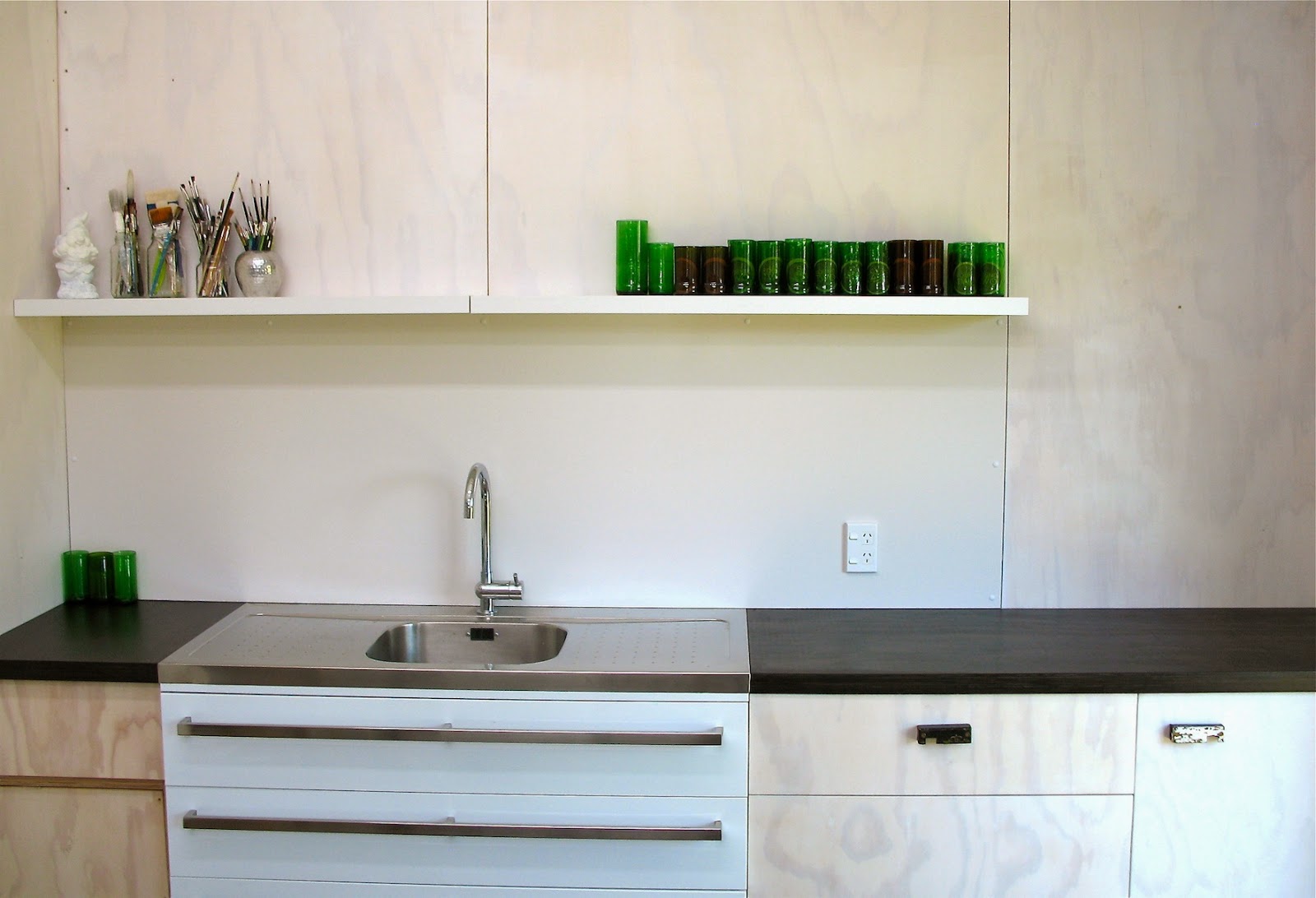
Before and After Photos: Studio Sink Splash Back and Shelf


Not sure why it took us so long to get around to it... only took two and a half hours! Easy.

Sunday, 10 November 2013

Sumi Ink and Graphite Media Study


Steph Chalmers - Sumi Ink and Graphite Media Study - 2013

Thursday, 31 October 2013

I Care A Lot About Printmaking

... So, here's an essay I wrote about an exhibition I curated:

(Click here for The Status of Printmaking - Peter Dornauf's review of Proof Makers.)

PROOF MAKERS

There is a recurring theme in recent exhibitions featuring printmaking — their titles alone indicate their common aim. Crossing Boundaries at North Art, Crossover at Papakura Art Gallery and Boundless at ArtsPost Galleries. Each of the exhibitions demonstrates and celebrates that printmaking is diverse, complex and continually evolving.

Proof Makers is another exhibition where one link ties a group of artists together with a curatorial aim to challenge conservative notions of what printmaking is and how it is constructed and presented. While the artists use printmaking techniques, they do not necessarily call themselves ‘printmakers’. Their art practices may incorporate drawing, photography, sculpture, painting, textiles, performance, origami or design. The works included in Proof Makers push traditional print paradigms by challenging scale or materiality, rejecting print conventions, and embracing other media or new technologies.

“When I overheard a colleague say to a student ‘why print — surely it’s quicker to make a painting?’ I knew there were still challenges, problems and obstacles to be overcome by artists who make prints. For us to assert and establish respect for printmaking, artists need to show that it does what no other media can do and, more importantly, we need to do this without the constant referencing of process. Print needs to ‘be’ its own mistress and continue to evolve, change and be as innovative as it has been for centuries. From moveable type to woodcut to etching to screen print to text-based works to the digital — and everything in between — 21st Century print needs to claim its place within mainstream contemporary art.”
Carole Shepheard, 2013

Proof Makers asserts that printmaking is worthy of respect, and it was Carole Shepheard’s work Blueprint for Yves 1 that seeded the idea for this exhibition. The work read literally: ‘PRINTVERSUSPAINT’, and was a direct provocation to challenge assumed hierarchies of art making — a hierarchy that in turn affects the judging, exhibition, curation and collection of art. Blueprint for Yves is extended in Proof of Intent 3 (below left), the work shown in this exhibition. Along with other works in Proof Makers, it reminds us that any demarcation of art practices is limiting.


Shepheard’s provocation requires us to recognise that there are many methods used to stretch printmaking in new directions. The module, or multiple, used to extend the scale of a work beyond the constraints of a conventional printing method is employed by Shepheard, Nicol Sanders-O’Shea, Philip Carbon and Lynn Taylor. Their works have an impact that could not be achieved with a singular unit.


Screen-printing directly onto board, Nicol Sanders-O’Shea does not edition her work. Instead she makes unique variations and presents the work Per Diem (right) as a large collection of randomly hung disks. She says, “I layer patterns and imagery to subvert or disrupt the implied meaning. [...] I purposefully make the ink run or wipe it off to make appropriated imagery slip and morph. It is an attempt to create a visual record of my mixed recollections, something I have witnessed past or present, reality or fiction.” The mass-production nature of print is undermined by Sanders-O’Shea as the many parts of Per Diem are as ‘one-off ’ as any painting or drawing would be.


Philip Carbon calls his work Assemblage of Nine 2 (left) a “reaction against small and precious prints/works on paper.” Made by inking up large sheets of found scrap metal, the piece is visual trickery — contradicting the fragile materiality of the paper by masking it with the appearance of corroding metal. Edge-to-edge printing and the addition of carefully patinated eyelets visually transform the paper into something rugged and hardy. Carbon allows for the configuration of the set to be determined by others, extending the position of ‘maker’ to someone else.


Lynn Taylor’s work invites collaboration and interactivity with the audience. Her work Graphic Overlay: North Meets South (right) is the result of overprinting plates that had been placed on location at the University of Waikato and Dunedin School of Art to be scratched anonymously by staff, students and visitors. Taylor could not predict or pre-conceive the results of the mark-making, but composed them into a finished piece through rotation, overlay, puncture, repetition and colour. Inviting further interaction, Graphic Overlay: North Meets South is designed to be rearranged by viewers while it is on display.3


Olav Nielsen’s The Magpies Said (left) engages new audiences. The artwork is adorned with the brass mezzotint plate itself, revealing the production process to those unfamiliar with the medium. While The Magpies Said is more ‘traditional’ than some of the other works in the show (as a cleanly registered, conventionally inscribed mezzotint), Nielsen’s use of the plate to complete the work is a rejec- tion of traditional editioning and presents to us the labour and love involved in making one’s work. Nielsen’s beautifully crafted piece draws attention to the plight of bee colonies and the potential collapse of our ecosystem as a consequence of upsetting a delicate symbiotic relationship.


The antithesis of Nielsen’s meticulous piece is Struan Hamilton’s work Lebbeus Suite V 4, (right) a rough and visceral work on canvas that asserts a different kind of control. With a rejection of delicateness (not unlike Carbon), Hamilton creates large and expressive works that are best described by Allan Smith of Elam: “There is a heavy metal clamour and dirty glamour; a post-cubist steampunk brutalism that runs through the improvisational webs, nets and techno-tangles of Struan’s acid-etched, scraped, polished, pressed and printed cartographies of ruin.”5 Hamilton’s metal plates are textured, sculptural surfaces — artworks in their own right, though not displayed — and the resulting prints retain a sense of movement and immediacy more often associated with painting.


Sam Harrison’s woodcuts are impressive not only for his masterly carving but for their sheer size. Tim and Siene (below) are not large by comparison to his colossal 3 × 2.8m work The Crucifixion (2009) held in the collection of The James Wallace Arts Trust. Harrison’s figures are modelled with sensitivity and empathy, and the near life-size scale of the subjects can be confronting. The grain of the plywood remains clearly apparent, with knots and imperfections speaking directly, and with honesty, to the viewer. Mortality and the human condition are the central concern of Harrison’s work, whether expressed through woodcut or life-size plaster sculptures. Harrison is hesitant to be labelled a printmaker, commenting, “I never really thought I’d be put in the category; it’s something that’s just happened — I don’t want to spend the rest of my life trying to shake it.”6


The works of Steve Lovett and Neil Emmerson initially do not present as uniquely ‘printmaking’ but they do reference and acknowledge the history of printed media in their work. Steve Lovett’s series of Cutbacks, which include Clean Cut and She Said She Was Hot Stuff (left), may be considered as photographic works. The Cutbacks are daily explorations where Lovett uses his own photographs along with inherited or found images, often from mass-printed media. The action of physically editing the images is important. Lovett carefully constructs new imagery by extracting elements with a scalpel, editing, layering and then re-photographing the resulting combinations. Spaces shift, receding and encroaching as the grafted images jostle for attention. It’s not immediately apparent, but a screen-printed layer glazes the digitally printed image, creating a matt void in which the figure is contained.


Emmerson’s triptych (I must confess...) 2013 (right) is the most social and politically charged work in the exhibition. Emmerson uses his artwork as a mechanism to directly confront homophobia and refers to the nature of print itself as political, in that a printed image can be reproduced and spread to a wide audience.7 The submissive shrouded figure in (I must confess...) 2013 relates to the contemptible treatment of Iraqi prisoners in Abu Ghraib by American soldiers ‘in the name of God’. Prisoners were forced to perform homosexual acts. The lettering ‘G.O.D’ printed on the subjects’ attire is Emmerson’s code for ‘Gay On Demand’. Confronting big issues and drawing on any appropriate media to do so, Emmerson’s art transcends any particular medium to operate in a borderless, cross-media environment.


Printmakers may no longer be comfortable being defined by their discipline because as artists they rightfully use the medium that best conveys their idea. This mirrors the shifted pedagogy of art schools in New Zealand; they are moving away from the notion of siloed disciplines. Printmaking remains present in art school curricula — for now — but specialising in a singular medium is no longer actively encouraged as the interdisciplinary model emerges.

Should we be concerned that we lose something by focusing on teaching thought over action? Making can lead to ideas. Owning a process and making it yours — being a specialist, a scientist and an expert in a medium, can empower both the method and the outcome. Mastering a process should not consign an artist to being an artisan or crafter. Equally though, ‘specialising’ should not tether an artist to the point that freshness and adaptability is lost. Striking a balance is surely the key.


“Too much hate for the craft kills the work of art and too much love kills the artist.”
Luis Camnitzer, 2006


In his essay Printmaking: A Colony of the Arts, Luis Camnitzer describes print- making as “the best example of the conquest of technical fundamentalism over the creative freedom of art making.” He goes on to say that “once artists print, or know how to, the hope arises that something with artistic merit will automatically follow. Making prints is the task. Art seems to be a miraculous by-product.”8 To paraphrase Camnitzer further: Too much love for the craft kills an artist’s creative expression and too much hate for the craft kills the work of art itself.

The artists in this exhibition encourage us to move across boundaries and reconsider our preconceptions. They strike a balance between technique and vision and in doing so prove that printmaking is challenging, current, and evolving. They are Proof Makers.

Steph Chalmers – Art Collection Curator, University of Waikato


Of the nine artists in this exhibition, six are dedicated educators. Dr Carole Shepheard was a Professor of Fine Arts at the University of Auckland from 1989 to 2006 and has taught or influenced many artists working in New Zealand today. Steve Lovett teaches in the University of Auckland Bachelor of Visual Arts Degree programme and Manukau Institute of Technology Diploma of Visual Arts programme. Struan Hamilton is theTeam Leader of Printmaking at the University of Auckland. Nicol Sanders-O’Shea is the Programme Co-ordinator of Art at Bay of Plenty Polytechnic. Neil Emmerson is the Print Studio Co-ordinator at Dunedin School of Art at Otago Polytechnic. 


1. Blueprint for Yves was a finalist in the The New Zealand Painting and Printmaking Award 2013. The work makes reference to Yves Klein (1928-62), a French artist with a short-lived but very diverse career including printmaking, painting, sculpture, performance, sound, spatial intervention, architectural projects and art theory.
2. Of which we have five on display.
3. Photographs of new arrangements can be posted

to www.facebook.com/lynntaylorartist.
4. Lebbeus Suite V makes reference to the work of

American artist and architect Lebbeus Woods (1940-2012).
5. Allan Smith in a statement for Struan Hamilton’s exhibition Cartographies or Ruin at Saatchi and Saatchi Gallery, Auckland 2013.
6. Sam Harrison quoted in Conversations with the Body, Dan Chappell, Art News New Zealand, Winter 2011.
7. Bridie Lonie in a statement for Emmerson’s (I must confess) II exhibition at William Mora Galleries, 2011.
8. Printmaking: A Colony of the Arts, Luis Camnitzer, 2006. Originally published in theText Archive of the Melton Prior Institute for Reportage Drawing.Lynn Taylor has tutored in art theory and printmaking at Dunedin School of Art. 

Tuesday, 18 June 2013

Something Different

Fig. 1 - Plywood, paper, wood veneer, thread, ink, acrylic, pencil - approx 600 x 400 mm - Steph Chalmers - 2013

Fig. 2 & Fig. 1 - Plywood, paper, wood veneer, thread, ink, acrylic, pencil, tacks - Steph Chalmers - 2013
These works were made for a group exhibition - Opening this Friday night:


Thursday, 28 March 2013

My results from a Sumi Ink Workshop with Max Gimblett

A letter of the alphabet - S - Steph Chalmers with Max Gimblett - 2013
A mass of black - Steph Chalmers with Max Gimblett - 2013
An incomplete enso with a characteristic in and a characteristic out - Steph Chalmers with Max Gimblett - 2013

(It's been a while...)

I made more than 10 drawings in the workshop today but this is my edit of the group. 

It was truly an honour to meet Max and see him in action. www.maxgimblett.com

Saturday - I am going to Wah Lees in Auckland - I'm going to get me a BIG Chinese calligraphy brush.

Sunday, 17 March 2013

Before and After Photos: Restoration of Plaster Madonna and Child

A friend-of-a-friend was devastated when her cherished Madonna and Child toppled and smashed at a party. When we heard the story we thought we could help - when we saw the first photograph below, we momentarily thought we couldn't - but after 20+ hours of very careful work we managed to put her back together.


Friday, 1 March 2013

Ink Drawings: Album Art for 'A Lone Cloudburst' by Sink \ Sink

A Lone Cloudburst - Front Cover - for Sink \ Sink - Ink on Paper - Steph Chalmers - 2013
A Lone Cloudburst - Back Cover - for Sink \ Sink - Ink on Paper - Steph Chalmers - 2013


www.soundcloud.com

www.facebook.com/pages/Sink-backslash-sink

Monday, 3 September 2012

A "Yay!" for Printmaker Prue MacDougall

New Zealand Printmakers: A MiniPrint Winner from NZ! Woohoo!: A big congratulations to Prue MacDougall for being one of the winners at the international MiniPrint competition 2012 which was award...

Monday, 6 August 2012

A Work Remembering Hiroshima

Hibakusha/Survivor - Indian Ink Painting 2010

There is an earlier, one-off drypoint version of this composition. I did a lot of post-print painting on it, and was really proud of the finished piece. I made the background a deep blood-red, it had the Genbaku Dome (the Hiroshima Peace Memorial) and a bare tree, faintly in the background. Enola Gay, the plane that dropped the bomb, is fleeing the scene, and I embossed a circle in the centre referencing the Japanese flag. Another embossing of a 1945 NZ coin at the bottom acknowledged the aid given by the NZ J-Force, post war. I wasn't expecting the original to sell, so didn't bother to take photos. Alas, it sold. I missed it, so I made this! 

Moral of the story: Take photos!


Tuesday, 31 July 2012

Emily's work for EXHIBIT//EXHIBIT

Morphology 1-12 (detail) - Monoprints - Emily Rumney - 2012

Sunday, 29 July 2012

New work for EXHIBIT//EXHIBIT

Our talented crew of twelve team mates from the Museum are currently exhibited at David Lloyd's Gallery (see details below).

This is the piece I'm showing...

Bloodlines Diptych - Drypoint on canvas/Mixed media - Steph Chalmers - 2012

I worked from a stunning portrait of my paternal grandmother to create this diptych. I haven't managed to capture her, but somehow that becomes part of the work. She's always been an enigma to me.
In the drypoint (left) her face looks off kilter as it's a mirror-image.
The red piece is a pin and thread drawing, and even though it's abstracted, it looks more like her.
There must be more of a resemblance between us than I thought because many people at the exhibition opening assumed that it was a self-portrait.


Bloodlines Diptych - Steph Chalmers - 2012
Exhibition Details


Friday, 15 June 2012

Very Early Work

I have a memory of painting a kiwi on brown paper at kindy. I remember standing back and looking at the finished painting with the teacher, and her asking, "tell me about what you have painted?" and I thought, "what do you mean, can't you see that it's a kiwi?"

I did the painting below at age three. Clearly a tree, a kiwi and Santa... thanks to the labelling by a helpful adult.

Tree Kiwi Santa - Steph Chalmers - Aged 3 - c.1982
Mum held on to a good collection of my early work. There are quite a few kiwi.
Here's one tidy specimen sniffing a tree:

The Kiwi is Sniffing the Tree - Steph Chalmers - Aged 3 - c.1982
There are so many gems on newsprint in the box of artwork that Mum kept for me - I could post one a week for several years. Thanks Mum.


Studio Progress

Intaglio Printmaking Press - made by my uncle Martin
We had expert help to help move our press into the studio - thanks so much Marty.

We're still building and organising storage. Emily's framing moulding will soon be off the floor and safely housed in an upright store infront of the small wall on the left side.

Studio in progress - June 2012

Wednesday, 16 May 2012

Oliver Jeffers at the Writers and Readers Festival 12th May 2012

First page of my freshly signed copy of The Heart and the Bottle by Oliver Jeffers
Oliver Jeffers did a fantastic job of tailoring his presentation to suit the audience, which was full of adorable, wide-eyed children. He was very entertaining and spoke with refreshing candor about his work and about making picture books. From the drawing demonstrations to the making of paper planes, every minute was engaging.
I'm looking forward to his next book, This Moose Belongs to Me, which he laughingly described as "a thinly veiled platform for my political rantings." Love it.

Afterwards at the Book Signing
Em and I stood patiently in line debating which books we should get signed... we had all of them with us but it seemed rude to present him with a pile! I decided on The Heart and the Bottle (above) and The Great Paper Caper.

Oliver Jeffers: Can I make these out to someone?
Me (star-struck): Hi. Um. Nah, that's okay, thanks.
Oliver Jeffers: Will probably be worth a bit more on eBay that way, aye?
Me (in my head): Doh, oh no! That wasn't what I meant! Ah!
Me (out loud): No, they absolutely won't be going anywhere! I promise.

It's hard meeting your heroes. He was so cool. And I was so not.
Writers and Readers Festival

Saturday, 5 May 2012

Brooch Appreciation

I do like a good brooch.

Appreciating our small collection

Left to Right, Top to Bottom:
1. Felt, silk and thread in oval silver ring - by Karen Michaud.
   This one pretty-much guarantees me an admiring comment from a stranger.
2. Anatomical Heart - by Mamas Little Babies bought at The Vault, Wellington.
3. Runaway Girl Medal - by Karen Walker Jewellery
4. Moth - by Lisa West
5. Brooch found in an antique store in Napier.
    It has an odd little house with a fence. The perspective of the engraved image is very disconcerting.
    If anyone knows anything about this kind of brooch, I'm eager to know more.
    Admirers always find this one odd and confusing.
6. By me. Painted plywood. Have not worn this yet.
7. Tiny red butterfly - (not sure of maker) from ArtsPost, Hamilton.
8. Green Caravan - by Lindsay Park. Most popular comment = "cute!"
9. Printed leaf brooch - by Emily.
10. Speechless - by Genevieve Packer
     (the bubble should be empty to show the fabric of the garment it is pinned to... Emily made sweet little printed inserts to go with it).
     We saw Genevieve speak at a Design Symposium a few years back and we've loved her work ever since.
     Loads of great products on her website!
11. Matchstick - by David Mcleod, bought at the Quadrant Gallery, Dunedin.
12. Queerbird - by John Z. Robinson, work available at Quoil, Wellington.
     Em loves to wear this one.


The Broach of the Month Club in association with Masterworks Gallery is an excellent idea.
This project brings together 12 brooch-makers with 12 brooch-wearers.
Wearing an unusual brooch undoubtedly invites people to comment. Broach of the Month Club latches onto this phenomenon, getting wearers to document, and share, their wearing experiences.
The main reason I think this project is so cool, is that it records a life of the artwork, providing valuable feedback for the artists.
We artists are intimately engaged with the things we create, then we let our creations go with a high likely hood that we'll never see, or hear, of them again.
As a curatorial device, this idea adds a level of interactivity and story telling that makes the exhibition more interesting and the individual brooches more desirable. Winning formula!
Oh, and I like the play on words brooch/broach.